About the client
Driving with Dogs is a membership website that lists places to walk your dog. It focuses on walks near motorway junctions so you can find a really good spot to walk your dogs on long journeys, instead of making do with a service station car park.
Since 2008 they’ve developed a large and loyal membership base, a huge number of walks listed (over 3,000 in the UK and France), and received rave reviews for the service.
Their problem was a 10 year old website that was creaking and on the verge of collapse. Features had stopped working, it used Flash (which was no longer supported in most web browsers), and was well overdue an upgrade.
Discovering the road to success
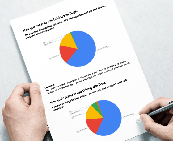
Early discussions revealed a lot of options available, such as a mobile app, an update of the existing website, or a complete re-think of everything. As the members were the key to this project, we started with a survey to find out what they thought.
The results showed that users wanted to find walks on the move, but still be able to plan journeys in advance from home. Based on these results, we knew we needed to rethink the entire project from scratch, improve User Experience and make finding walks a quick, simple task whether you’re sat at a desk at home or passenger in a car on your mobile.
A new, modern brand
We all agreed that the Driving with Dogs was lacking a real identity. There was an existing logo that was not really workable at smaller sizes or in print, and the visual branding didn’t really extend beyond a rather outdated logo.
Using the insights gained from our customer research, we developed a new brand identity that was playful and fun, just the right tone for their target audience - but still in keeping with the style current members had loved.

Memorable, unique and versatile
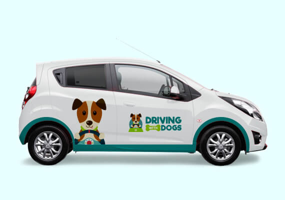
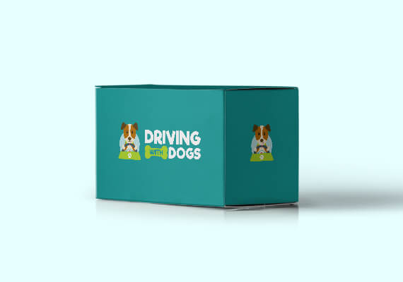
The logo is instantly recognisable, scalable and can be used across a huge range of mediums - perfect for a client who gives away free branded goodies.
Developing a system and building on the existing community
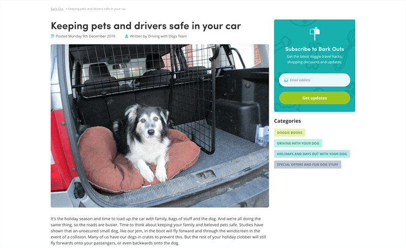
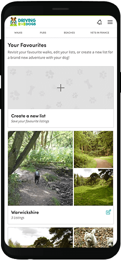
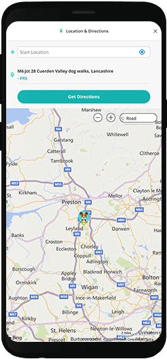
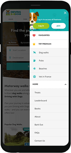
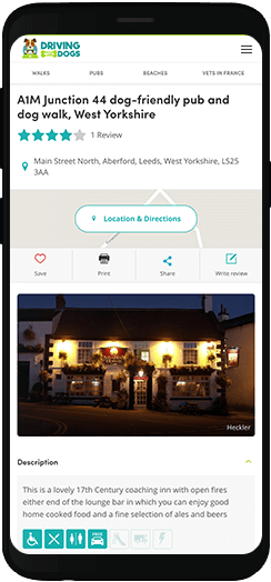
User experience was the key to success with this website. The whole strategy was to make it simple, easy and fun to be part of the DwD community. We developed a route planner with GPS technology to make finding walks easy, both in advance and on the move.
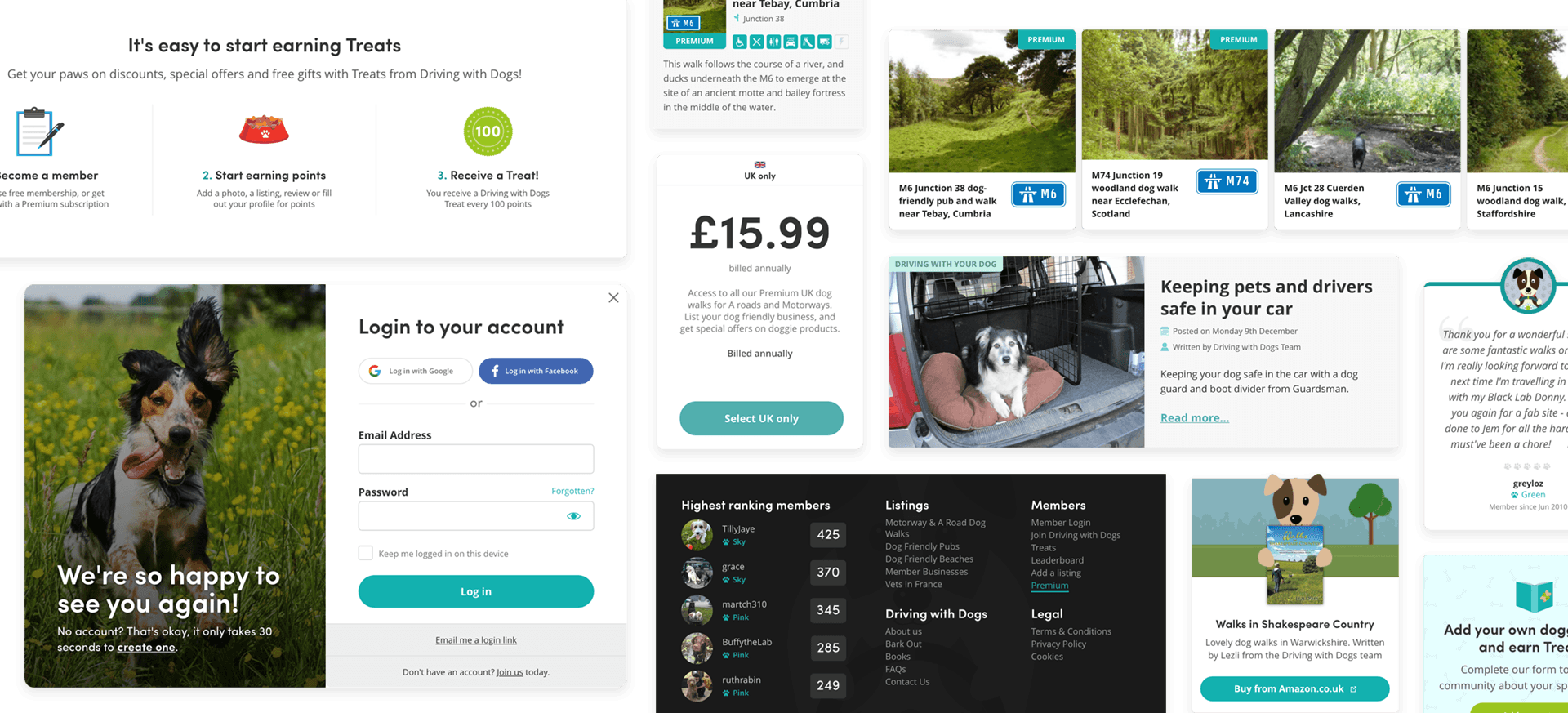
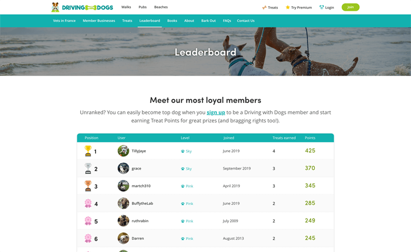
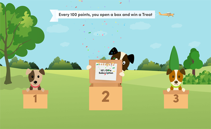
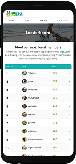
We also introduced a “treats” reward system to encourage users to engage by contributing their own reviews, photos and new walks. This includes a leaderboard for the most active members, and rewards for every 100 Treat points earned.
Driving forward
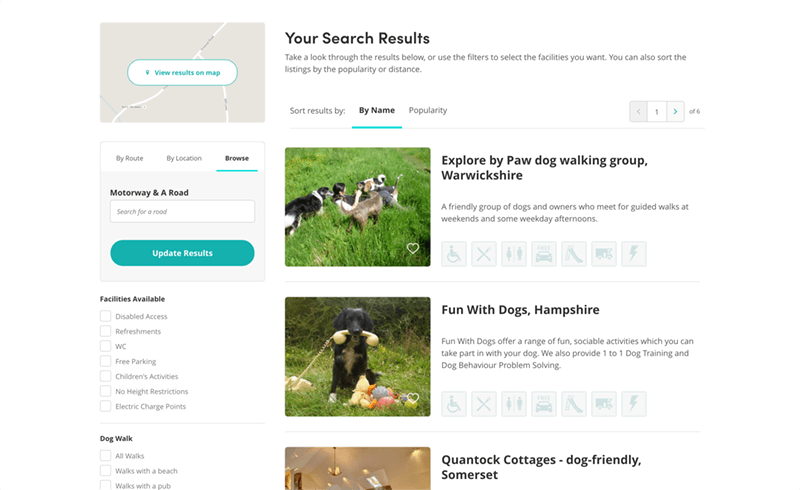
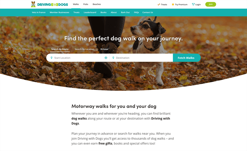
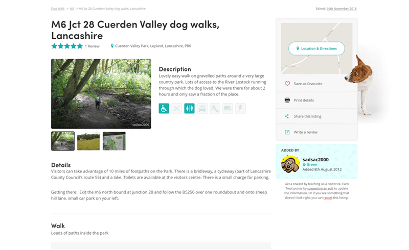
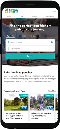
The search interface is the very first thing users see on the home page. No more digging around or needing extensive knowledge of motorway junctions to find the best walks for your dogs.
Live Website
Numbers that make your tail wag
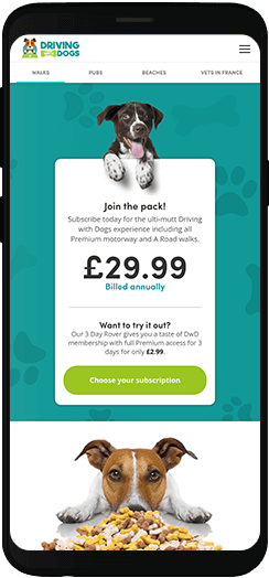
The new website has revitalised the Driving with Dogs membership base, and has had a big influx of new subscribing members too.
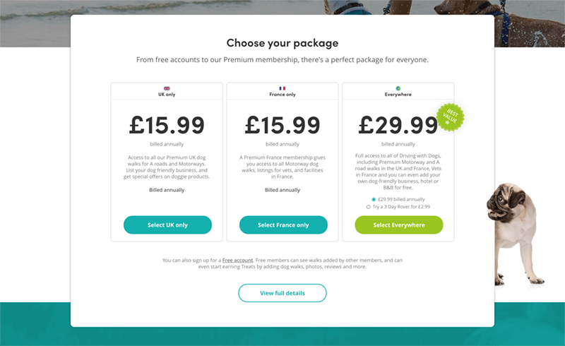
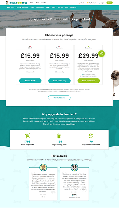
The huge improvements in User Experience and SEO have made it incredibly simple to subscribe and start using the website, and the restructure of pricing and new rewards system has given people extra incentives to be part of the community.

Statistics from the first 12 months
How do you choose a web design team?
For a small business without technical know-how it means you have to kiss a lot of frogs in suits before you finally reach the people who really can deliver on their promises. It took us over two years to find Edge of the Web and they were definitely worth waiting for.
Edge of the Web has in-house people with impressive technical skills, and clever designers. But what sets them apart is the ability to communicate with clients, the integrity to do the best for the project and not waste time and money on short-term solutions, and the willingness to listen and understand a brief.
For us, Edge of the Web have become trusted allies over time and we’d unreservedly recommend them.

Ready to get the Edge?
Become our next successful case study. If you have a project, whether it’s big, small, complex or simple, we’d love to hear from you.
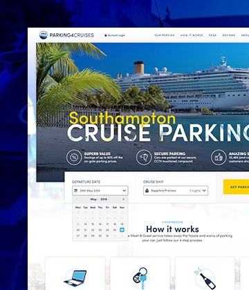
Parking4Cruises
Industry-first innovations resulted in a Return on Investment of 253% after the first year alone.
Read Case Study
Becky Kerr
A new website and SEO campaign has increased business in a highly competitive sector.
Read Case Study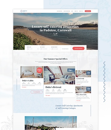
Padstow Breaks
Amazing luxury properties showcased by a stunning brand and website design.
Read Case Study
