About the client
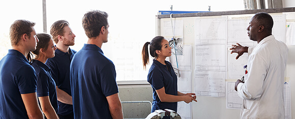
MGTS is a long-established business and charity offering engineering training and apprenticeships, helping to both upskill seasoned engineers, and kick-start careers for those starting out.
With over 50 years’ experience, they’d expanded their knowledge and offering over time. As their website had also grown to reflect this, it lacked a coherent structure and consistent messaging.
The company has a range of audiences they need to talk to, from apprentices and parents to corporate employers. They needed a modern, responsive website with a streamlined navigation, making it easier for each audience group to find the information and support they need.
Our strategy for success
By getting to know the business first, we were able to create a logical website architecture, and develop a bespoke design system - allowing MGTS to manage the website inhouse.
The Challenge
We needed to streamline the navigation and site structure to showcase all MGTS has to offer and allow their target audiences to find the information they need quickly and easily. It also needed to be managed in-house, and celebrate their long-established brand through clever design.
The Solution
We developed a new site map based on in-depth consultations with the team and created a design system which allowed their team full control. We carried their brand colours and logo throughout the site, integrating design and imagery for more brand consistency.
The Results
Initial feedback has been very positive. The new design gives MGTS the edge as a modern and instantly recognisable brand in their sector. The logical site structure makes for a smoother user journey, integrating third party platforms to reduce admin time and allow users instant access to the information they need.
Starting from scratch
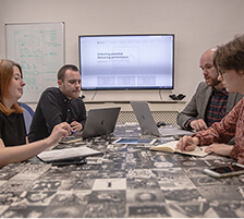
We wanted to get to know the business from the ground up. We spent a day on site and collaborated with their training, recruitment and sales teams to build a comprehensive project strategy and gain an understanding of their requirements.
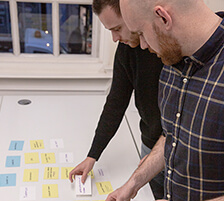
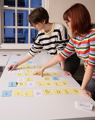
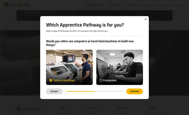
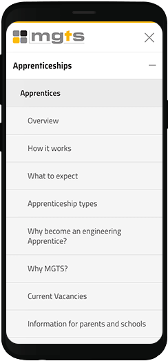
Together we used a collaborative card-sorting exercise to understand the different content types needed, identify any gaps in content and sort them into logical groups to provide the basis for a site structure. From there, we were able to start building the wireframes and prototypes for a new website driven by user experience and messaging.
Defining the brand and creating consistency
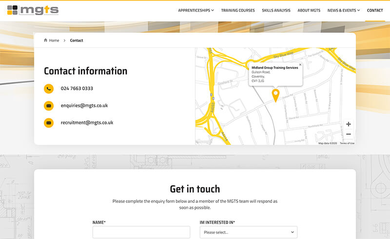
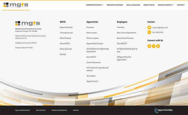
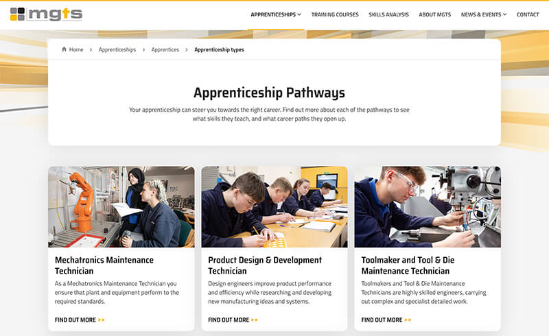
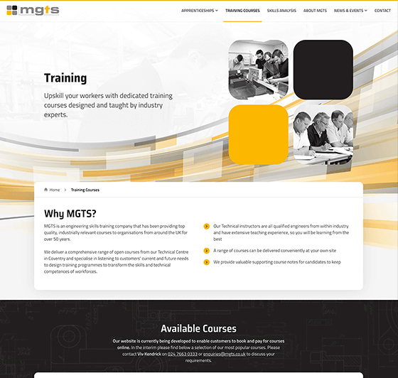
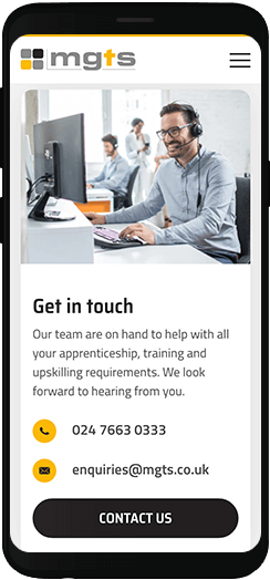
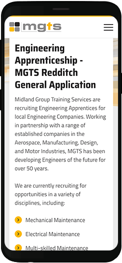
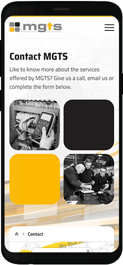
MGTS has a long-established brand and recognisable logo. We wanted to retain this but build upon it to give their digital presence a consistent and defined look and feel. Using their core colours we created additional design elements and shapes to add a sense of movement throughout the site header and footer. This shape – or swoosh – is transferable to their marketing materials, creating a more consistent, contemporary brand.
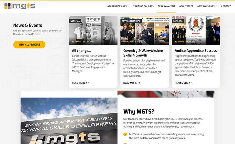
We also integrated the logo throughout the design, combining photography with the branding for a flexible approach which keeps the brand at front and centre.
Continuity in design
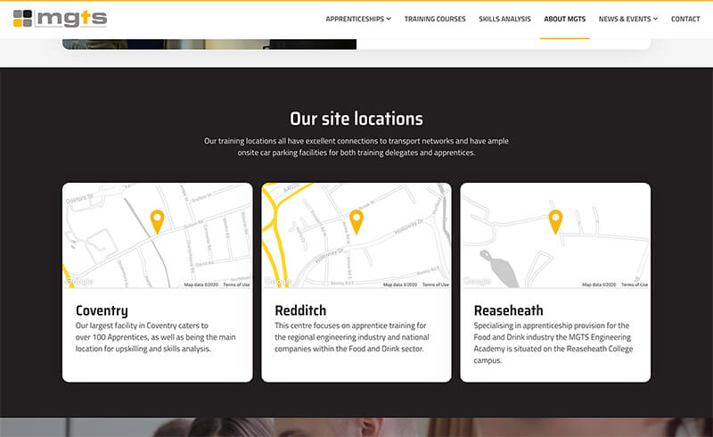
We kept the company’s logo and core colours at the heart of this website design, while giving it contemporary feel and ensuring it's easy for the user to navigate.
Live Website
A flexible design system using Wordpress Gutenberg
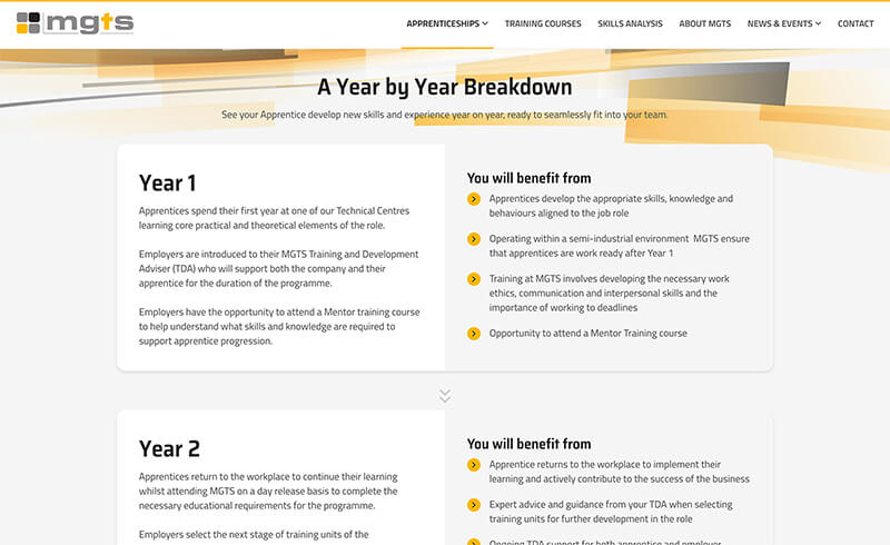
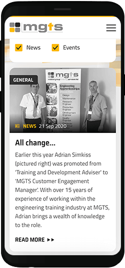
The team at MGTS wanted to be able to manage their web content in house post-launch, but still have plenty of flexibility and customisability options. To achieve this, we created a design system using bespoke blocks, which the team would be able to manage themselves via the Wordpress Gutenberg CMS.
Each element was specifically designed with the business’s needs in mind, based on our previous work building the content strategy and wireframe feedback. The entire website is built using these design blocks, meaning that it’s tailor-made, whilst being flexible and easy to manage on an ongoing basis without the need for regular input from a developer.
Third party Integration
As well as finding a home for a wealth of information on the MGTS website, we also needed to integrate information from third party platforms.
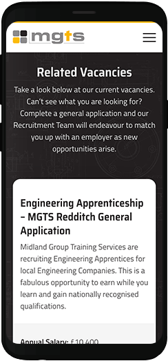
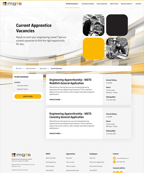
For vacancies, MGTS uses specialist apprentice recruitment software Enrola. We integrated this onto their Vacancies page making it easy for users to view an instant job board pulled through from Enrola, and filter by various categories and location.
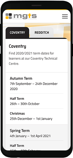
We also implemented real time integration with AccessPlanit, their training management software, allowing users to view a training schedule and calendar, with the option to manage bookings online in the future.
These integrations helped to improve user experience, allowing them to find what they’re looking for, all in one place.
-
+20%
Avg. mobile session duration
Our optimised mobile experience resulted in users spending more time on the website.
-
38%
Reduction in bounce rate
Users were significantly less likely to leave the website upon landing on an initial web page.
-
+34%
Pages per visit
The much improved website architecture provided a logical, enhanced user journey.
-
+11%
Unique page views
SEO optimisation and best technical practices significantly improved Search Engine visibility.

Excellent customer service
It has been a pleasure working with Edge of the Web to create our new website. We have loved their creativity, professionalism, guidance and patience! Thank you team, we can't recommend you enough.

Ready to get the Edge?
Become our next successful case study. If you have a project, whether it’s big, small, complex or simple, we’d love to hear from you.

Becky Kerr
A new website and SEO campaign has increased business in a highly competitive sector.
Read Case Study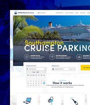
Parking4Cruises
Industry-first innovations resulted in a Return on Investment of 253% after the first year alone.
Read Case Study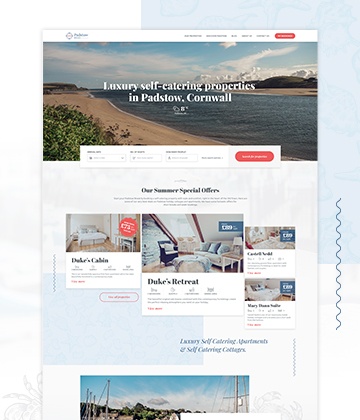
Padstow Breaks
Amazing luxury properties showcased by a stunning brand and website design.
Read Case Study
