
About the client
Since 2008, Padstow Breaks have offered holiday accommodation in the pretty Cornish town of Padstow, known for its high end food, art and culture.
Their properties and the luxury service had rave reviews online, but the website wasn’t showcasing them properly. It looked old, didn’t reflect their level of service or the style of the accommodation, and wasn’t inspiring enough confidence to book directly.
Their target audience expect the very best - which Padstow Breaks absolutely provides. But they needed a website that reflected that luxury service so customers would feel confident enough to book
Our strategy for success
Padstow’s branding and website needed to give their audience the confidence to make a booking.
The Challenge
The style of the logo and website needed to showcase Padstow as the luxury brand they are. But we also needed to navigate a 3rd party booking system which was outside our control.
The Solution
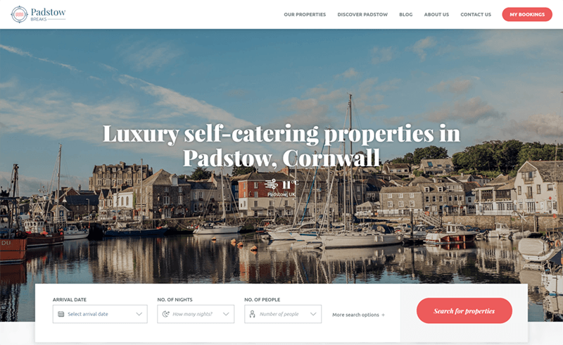
We designed a new brand, logo and style for Padstow, balancing modernity with the quaint feeling of a pretty seaside town. We then developed those styles on the website, really showing off the properties in all their glory.
The Results
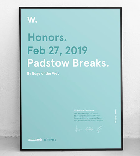
The new website has received fantastic feedback from customers, and won several design awards. It’s also reduced admin work by automatically synchronising information from the booking system to keep the site up to date.
A new brand for a new website
The old logo was very bland, and lacked that touch of professional creativity. We knew that this would be the first step to establishing Padstow Breaks as the luxury brand they are.
We created the new brand with a new colour scheme, typography, tone of voice and logo. Then we expanded these elements into the web design to create a full brand identity that balanced a professional, luxury feel with quaint style and personality.

Personality and style
The new Padstow Breaks brand identity needed to feel high end, but also approachable, matching both their luxury properties and the personal touch to their service.
The new brand had a high end feel without taking itself too seriously. It reflected Padstow’s Brand values of being a luxury, but approachable brand.
Creating a website that is a delight to use on mobile devices
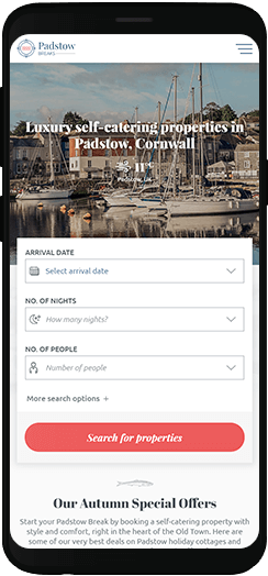
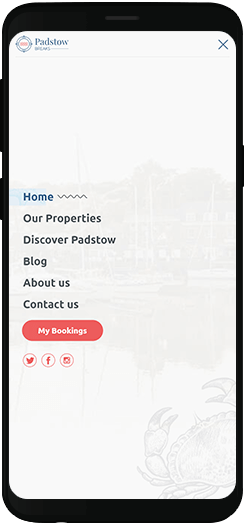
During our research, we discovered that a huge proportion of existing web traffic - 80% - was coming from mobile and tablet devices. We knew that the mobile experience had to be absolutely perfect - fast, intuitive and easy.
We did extensive UX testing on mobile, tablet and desktop versions of the website, making minor tweaks along the way, ensuring a fully optimised user experience on all devices.
Two sides of the coin
No matter how gorgeous the properties, people will only book if they see Padstow as the perfect destination.
Selling the destination
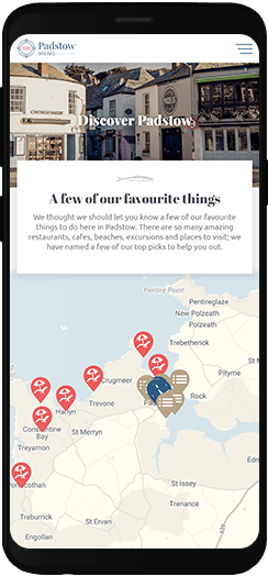
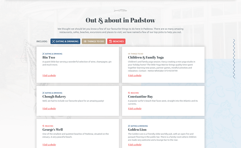
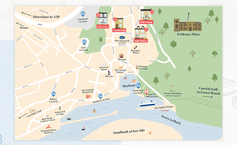
Padstow is one of the top destinations for UK breaks. So we created two map tools to promote the town itself, and what’s going on nearby. We also made use of photography of the surrounding areas, as well as Padstow’s pretty streets and harbour to really show off the style and ambience of the location.
Why Padstow Breaks?
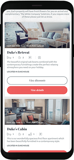
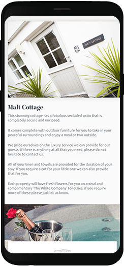
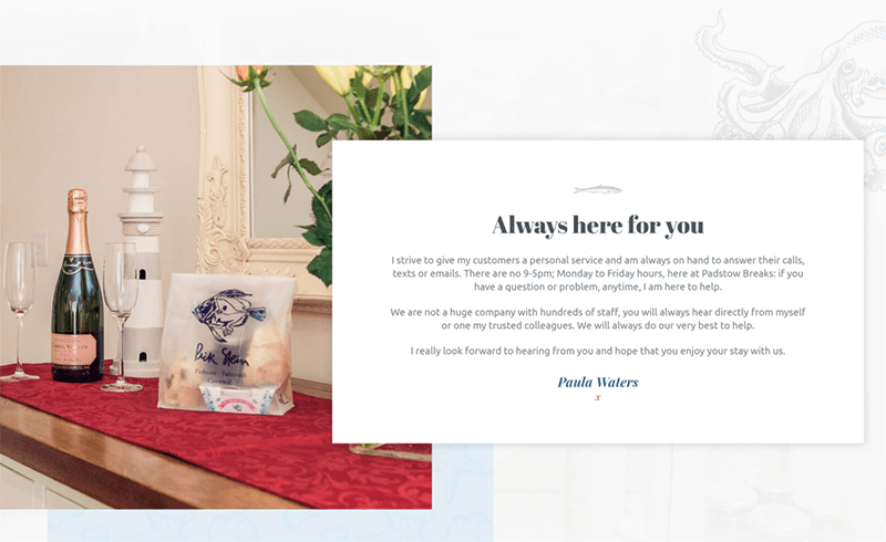
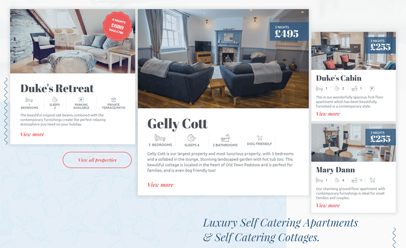
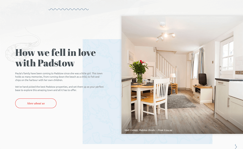
We also needed to promote Padstow Breaks as the right choice for accommodation. The photography of the properties themselves are a big part of this, as they radiate style. We backed that up with a personal message from the business owner, Paula, adding a personal touch and an approachable feel.
3rd party API integration for real time booking availability
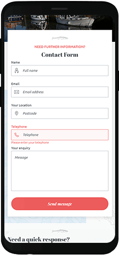
A big issue with the previous website had been customers requesting dates that had already been booked. But by integrating with a 3rd party booking system, Padstow Breaks could provide real time booking updates and pricing.
Having one central location to make updates cuts down on admin time - but also means that customers aren’t experiencing the immediate dissatisfaction of trying to book and being disappointed.
The best of both worlds
The new Padstow Breaks website strikes a perfect balance between a design that reflects the luxury and style of their properties, and a carefully planned user journey and features that make booking easy and obvious.
Live Website
My new website is awesome
Thank You to the Edge of the Web team for a fantastic product and continual service 🌟🌟🌟🌟🌟.
Ready to get the Edge?
Become our next successful case study. If you have a project, whether it’s big, small, complex or simple, we’d love to hear from you.
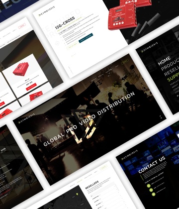
Symbiosis
This rebrand and redesign needed to appeal to distinctly different global audiences.
Read Case Study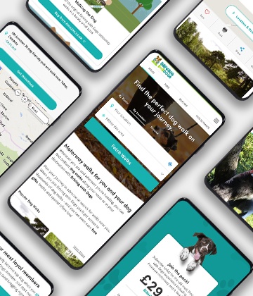
Driving with Dogs
A 10 year old website transformed from hobby to successful business with big revenue increases.
Read Case Study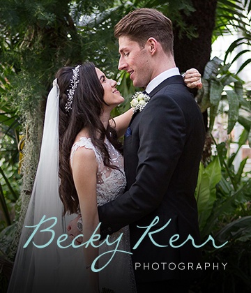
Becky Kerr
A new website and SEO campaign has increased business in a highly competitive sector.
Read Case Study


