
About the client
Symbiosis’ business model was previously based around providing software training, but they pivoted towards distribution some time ago. They now supply a network and support for products in the live television sector, operating in global markets from North America to the Middle East.
Their largest manufacturer, Decimator Design, rely on Symbiosis to provide a high level of service, including ongoing sales support for resellers, as well as direct customer support too.
With end users working in high pressure, technical environments, the Symbiosis website needed to reflect the high quality of the products they distribute as well as making it easy for customers to access the support they need.
Our strategy for success
A new brand identity, followed by a new website that balances the need to be impressively memorable and easy to use for users needing support.
The Challenge
We needed to start with the branding, and showcase who Symbiosis are today. Next we needed a structure and style that could target their 3 unique user groups, and provide each of them with the experience they need.
The Solution
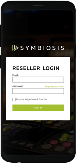
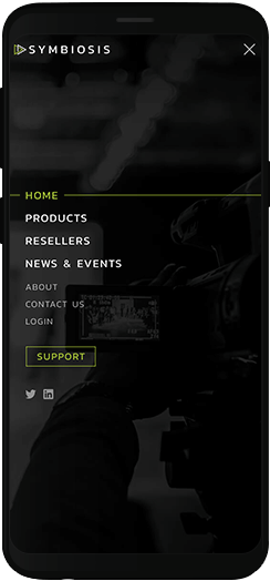
A high end, technical feel to the branding and design, really impresses Symbiosis’ position in the market. We also placed a support CTA prominently in the nav, which integrates with their software to make accessing support incredibly simple.
The Results
The style of the design is a great advertisement for the current product line, and by making support easy to access, the website showcases exactly why Symbiosis are a great distributor for high quality professional video products.
A modern rebrand
Not only had their branding lost meaning with the company’s change in direction, it had also dated quite badly. For a business in the technology industry, that is damaging.
We had to create a brand that reflected who Symbiosis are now. The new logo needed to show them as the high end, fast paced technology distributor they are. We created a clean simple style, and an icon that implies both speed and video technology.

Scalable style
The new identity looks great, and is really versatile, scaling amazingly well at different sizes and working on different mediums.
An animated approach
There’s nothing more vital in the technology industry than looking like a modern brand. Now that we’d created a great new logo for Symbiosis, the next challenge was to translate that into a website that was distinctive, memorable and modern.
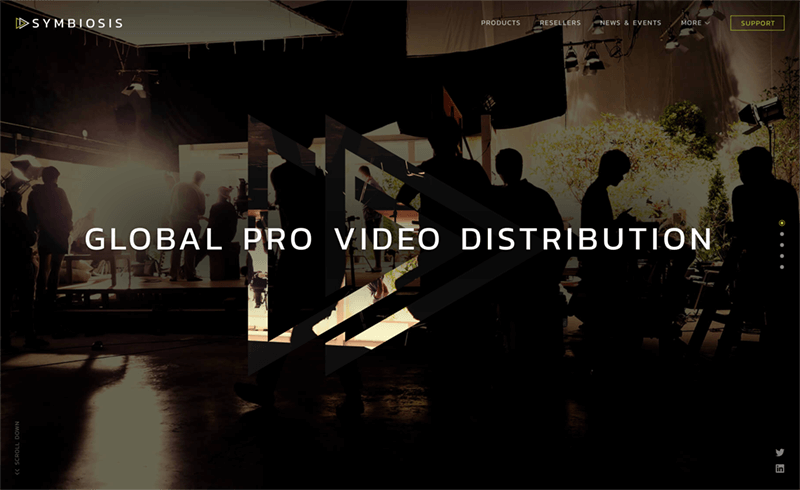
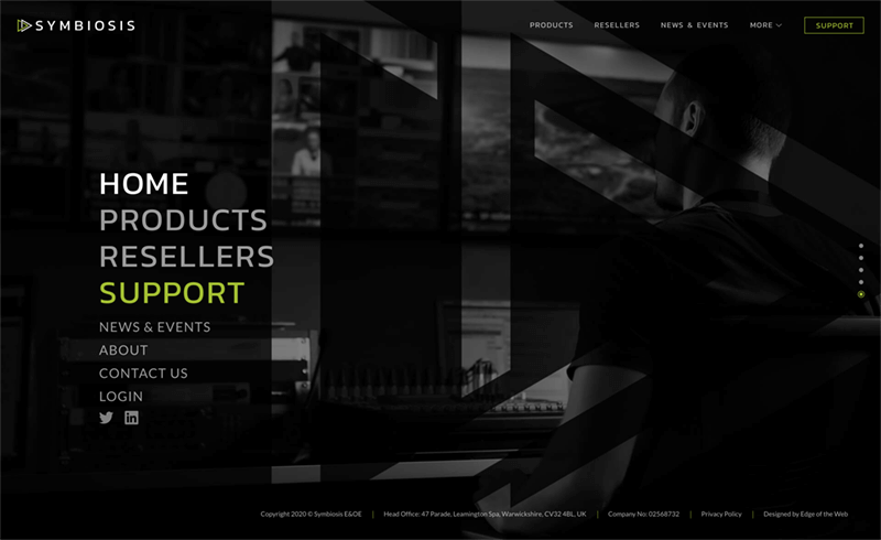
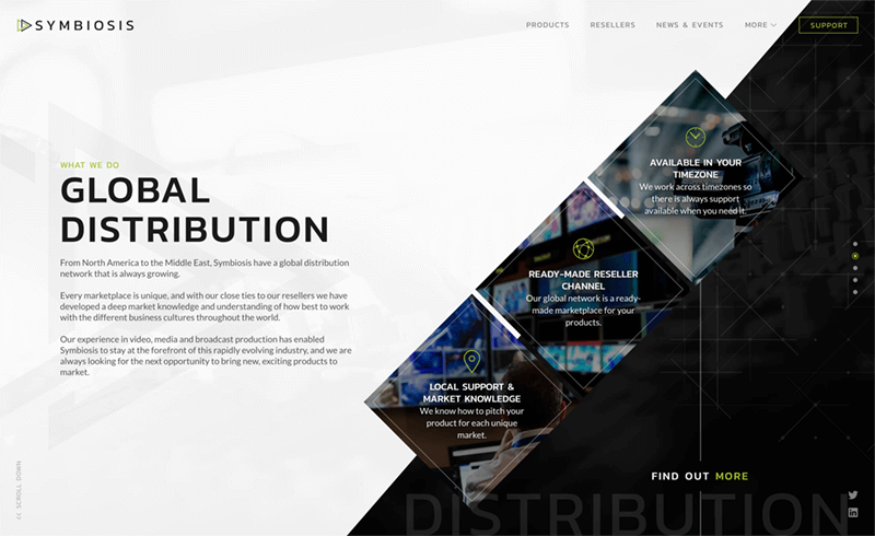
We decided to use unique animations across the website to make Symbiosis stand out. It’s a website that doesn’t need to use words to show that they’re a company at the forefront of technological progress.
The perfect balance of style and substance
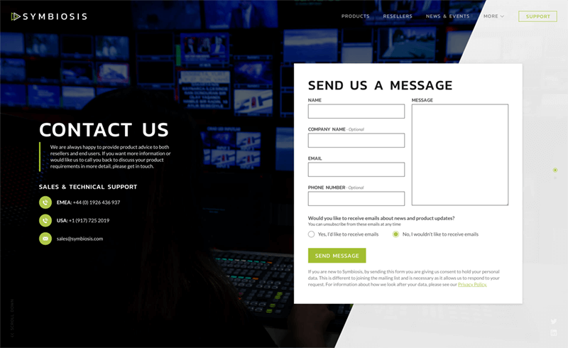
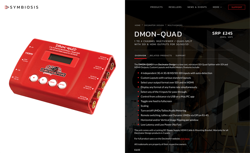
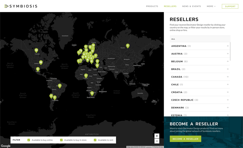
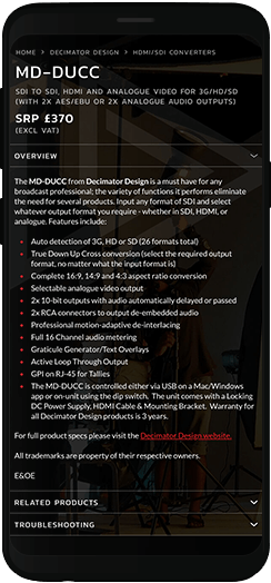
To cater to each of the target audiences, we split the sitemap into “selling” and “support” pages, with unique user journeys and outcomes for each.
Winning new business
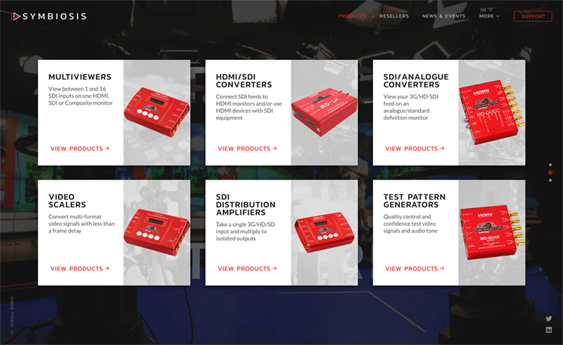
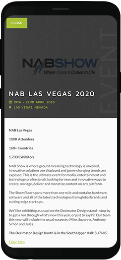
Selling pages focused on attracting new resellers for current Decimator Design products, and new manufacturers needing distribution. These pages could be quite indulgent in design, with attractive messaging and plenty of animation to impress a prospective reseller or client.
Supporting end users
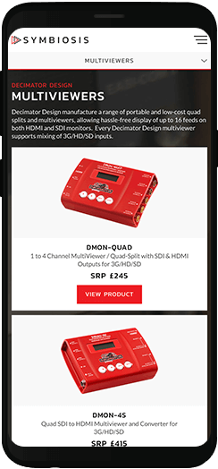
The support pages focused entirely on usability. End users of these products are usually working in live TV, so when they need something resolved, it needs to happen fast. Often they’re already frustrated by the time they’ve reached the website, so it was essential that we removed any barriers between them and getting their issue fixed.
Design in motion
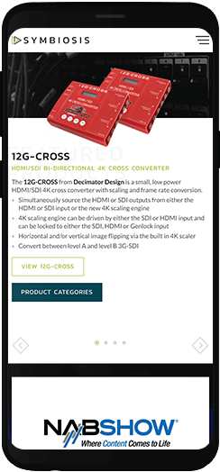
The modern style and animations for the home page shows Symbiosis off as a high tech company, but still enables users to easily navigate to the information they need without any difficulty.
Live WebsiteGetting animated about technology
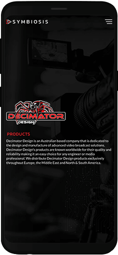
Making the website unique with its navigation and transitions really gives Symbiosis an edge. Their new website clearly stands out from its competitors, without sacrificing usability for those clients who need support quickly.
We included additional flourishes with content animations, which make the experience much more engaging, as well as showing technical flair throughout.
Ready to get the Edge?
Become our next successful case study. If you have a project, whether it’s big, small, complex or simple, we’d love to hear from you.

Becky Kerr
A new website and SEO campaign has increased business in a highly competitive sector.
Read Case Study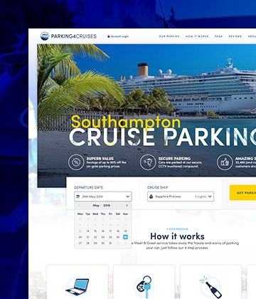
Parking4Cruises
Industry-first innovations resulted in a Return on Investment of 253% after the first year alone.
Read Case Study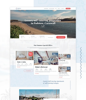
Padstow Breaks
Amazing luxury properties showcased by a stunning brand and website design.
Read Case Study


